
The location of your country on the map and the number of continents they taught you may not coincide with what is instructed in another country. What implications does this have for your worldview?
There are many videos on the internet making fun of people in the United States for their ignorance about geography. There is even a trend on the Tik Tok application about this. But how much is due to an educational problem and how much because of the way geography was taught? What impact can this subject have on a person’s worldview?
Much of the problem arises because United States citizens do not recognize America as a continent, which annoys Latin Americans (and rightly so). However, this confusion is due to the way they are taught geography. Like people in other countries such as Australia and England, they believe that there are seven continents, namely, Asia, Africa, North America, South America, Antarctica, Europe, and Australia. In contrast, countries like Mexico are taught that there are five: Africa, Europe, Asia, America, and Oceania/Australia. In Japan, people learn that there are six continents: Africa, Antarctica, Australia/Oceania, Eurasia, North America, and South America.
How the world’s division is presented is an essential part of how knowledge of the world is organized. The fact that there are so many differences explains the discontent surrounding the subject.
Even the Olympic Games’ logo includes five interconnected rings representing five inhabited continents, but which are these, and why is there no universal agreement about what are the continents?
What is a continent, and how is it divided?
To understand why there are so many discrepancies in the number of continents, we must understand what the word “continent” means.
The American Institute of Geosciences defines a continent as “one of the planet’s main landmasses, including the drylands and continental platforms.” Other Anglo-Saxon pages define it as “a large uninterrupted landmass surrounded by water.” Even the Royal Spanish Academy (RAE) describes it the same way, “every one of the large tracts of land separated by the oceans.” According to this second definition, North and South America should be one continent, just like Eurasia.
Geopolitics is one factor influencing the number of continents, depending on the source and the country. For example, all models consider Africa a continent. Europe and Asia are one sizeable continental mass. They can be taken as two continents, even while 77% of Russia is in Asia and is a transcontinental country partly in Europe.
Another model divides the land masses according to the tectonic plates. There are 15 tectonic plates, of which seven have about ten million square miles and correspond approximately to the continents’ shapes above them, following the model of seven continents.
Continents or cultural regions? Physical vs. cultural geography
Although these classifications are somewhat arbitrary and debatable, it is essential to have a designation of the world by zones that serve as a starting point for more information, such as what the countries are like, their cultures, art, food, ethnicity, and businesses, etc. These aspects tend to make people generalize the attributes of people in the continents, for example, to believe that all of South America speaks Spanish, including Brazil, which does not.
Other examples may be to say “Asian food,” rather than Japanese or Chinese, or to describe “African music” or “European art.” These generalizations even apply to people, describing someone with almond-shaped eyes as having Asiatic features without considering that India is also in Asia. The people there generally do not have almond-shaped eyes.
One way to see the world is by region, something that geographers do to facilitate their studies. In this model, there are eight regions, namely, Asia, the Middle East, and North Africa, Europe, North America, Central America and the Caribbean, South America, Africa, and Australia and Oceania.
Philip Bouchard, educator, writer, and software designer, writes that if the world were divided into cultural regions, such as sub-Saharan Africa, East Asia, South Asia (consisting of India, Pakistan, and Bangladesh), and the Middle East (from Morocco to parts of Afghanistan); it would be easier to sort the world and categorize the countries by culture.
America’s case is more complicated. According to Bouchard, several people in the United States draw the line between North and South America at the southern extremity of Mexico. They do not include the countries of Central America in North America; yet, it is part of their standard geographical definition. If America were to be divided by cultural regions, the Central American countries are part of Latin America. The rest would be Anglo-America, composed of the United States and Canada.
Then there would be the following regions
-
Europe
-
Middle East
-
Sub-Saharan Africa
-
South Asia
-
Oriental Asia or East Asia
-
Anglo-America
-
Latin America
To reach his conclusion, Bouchard focused on the following three concepts:
-
Each defined region must occupy a contiguous area of land.
-
Each region should be home to hundreds of millions of people.
-
A flat (non-hierarchical) model like this works best when the whole is divided into about seven parts, although it may have plus or minus one or two.
The above criteria, however, do not include Australia or island nations. If the adjoining land area requirement were removed, for example, Australia could be grouped with Anglo-America and England. The writer concludes by saying that traditional models based on physical geography are not ideal for learning about cultural geography. Understanding this concept helps to understand the world better and the ability to absorb details more quickly and have more accurate cultural generalizations.
The other side of geography: maps
Learning geography goes beyond cultural regions or defining conti
nents. Reading a map also has a significant impact on the way the world is observed. Plans are a teaching tool that are visual representations that shape the way the planet is understood.
Maps represent information, but their interpretation varies greatly depending on the context and the type. As on continents, there are different versions of plans, and they have different impacts on how people see the world.
Harley and Woodward describe them, saying, “Maps are graphical representations that facilitate a spatial understanding of things, concepts, conditions, processes or events in the human world.”
There are physical maps that show details and identify physical characteristics like rivers and mountains, and geographic ones that demonstrate landmasses. Political maps focus on dividing territories into concepts such as local authorities, states, and countries. Others are divided by language to highlight dialects in a physical area or country, and weather maps show things like sun, clouds, rain, and much more.
Historically, geographic maps have served to illustrate different points in time and the priorities of the creators, such as including a larger or smaller country. The Historian Dirk Raat describes how the Old World peoples, “the medieval Europeans and their New World counterparts organized space according to philosophical and religious principles.” This means that the maps represent more than the landmasses. They include how people see themselves and their beliefs concerning the land they occupy, demonstrating that maps have an inherently social and political weight.
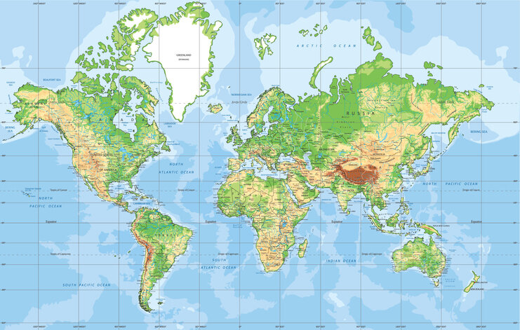
Mercator Map / BardoczPeter.
The geographic maps are distorted
In 1569, Gerhardus Mercator, a European cartographer, created a world map that remains popular today, the Mercator Projection. It has straight lines that represent constant directions on the surface of the earth, helping to navigate but not to visualize the sizes of the masses. So, it is not an accurate representation. It extends the parts of the world that are closest to the poles, making Europe, North America, and Antarctica appear larger than they are. This mistakenly misrepresents the region surrounding the equator as smaller, also.
This distortion becomes problematic when using this map in education. On this subject, Jane Elliot, a United States educator, explains at the end of an interview that almost the entire educational system in her country uses a Mercator map when teaching about the size, shape, and location of the landmasses. She is speaking of a version of the map that splits countries like China, India, and Russia to put the United States at the center, rather than being an accurate global representation. Also, Elliot points out that although South America is nine times larger than Greenland, on the map, it appears much smaller than Greenland.
This not only distorts the size of the United States but also changes things, such as putting the equator’s location in Iowa instead of Ecuador. This is because the Mercator model does not represent the hemispheres and continents as they are. Jane Elliot explains that “hemisphere” comes from the Latin “Hemi” and the Greek “ἠμὶ” (middle, half, semi), and the Latin “sphera” and the Greek “σφέρα” (sphere, circle). Thus, the equator should be represented in Ecuador and not in Iowa, which is a state in the United States. Besides, Mexico appears almost the same size as Alaska, although it is twice as large. Europe looks similar in size to South America, although the latter is twice the size of Europe. These discrepancies even inspired an episode of the program, West Wing. In the twentieth century, when many nations in the equatorial regions won independence, the Mercator Projection began to be criticized for these distortions, especially among the developing countries. In 1974, James Gall and Arno Peters published their global projection, which represents the sizes of countries more realistically. Even so, it is not perfect because it distorts shapes as it stretches countries near the poles horizontally and ones near the equator vertically when it presents the map on a flat paper or poster. Nevertheless, this model has gained a lot of popularity in world geography classes.
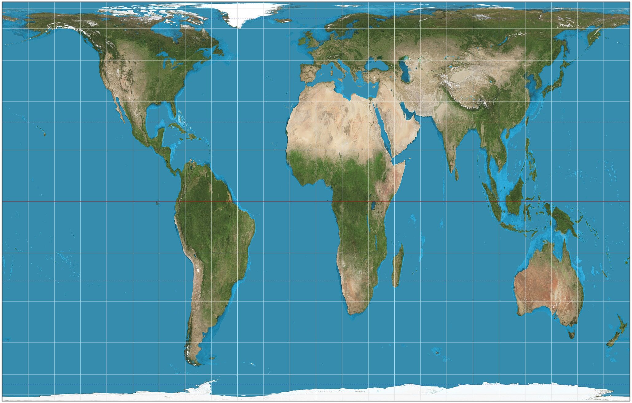
Gall-Peters projection / Wikipedia.
Elliot compares both maps to show how much the size of the United States and the predominantly white countries changed because Mercator designed his map based on the spread of Christianity. This explains why Europe is at the center of the map at the same apparent latitude as the United States and larger.
The social impact of educating children with the Mercator projection is that the United States is more prominent and more important because it is at the center of the map. This map exaggerates imperialist power at the expense of developing countries. It reduces them to inferiority, as with Africa, which appears similar in size to Greenland, although it is fourteen times larger. This also leads to associating the northern hemisphere with wealth and importance because it is at the top.
Digital maps: Google Maps is wrong
In February 2005, Google launched Google Maps, a digital map to create “the best map ever.” It has GPS and allows the user to zoom in or out to show the streets, traffic information, and many other features that old maps do not offer.
However, to date, this tool is based on the Mercator projection in its extended version. Using this tool to teach geography to students will create a distortion of size and the other problems that Jane Elliot pointed out. It wasn’t until 2018 that Google Maps launched its global version, where one can see the accurate relative sizes of countries.
Still, the creators of such platforms are not geographers. Programmers create algorithms that define how maps look and have not done sufficient study on how this tool influences people’s behavior.
While a lot of criticism and ridicule circulate about the lack of geography education in the United States, it is crucial to recognize that for a subject as important as geography, the lack of understanding often falls on the way it is taught.
Not having agreement on the number of defined continents stokes the eternal debate about whether Latin Americans are also Americans because those countries belong to América. It also puts Russia in the awkward position of belonging mostly to the Asian continent and Europe.
Besides, the way these continents are shown on the map and in the educational system carries the same weight as their definition. If geography continues to be taught through Mercator’s projection, the world will continue to be misrepresented. However, the alternative, which is the Gall-Peters (or May) projection, is not necessarily more correct because it shows distorted shapes. Changing the model means changing the mindset of generations who learned geography by seeing a distorted map.
Geography has a significant impact on our worldview; however, its education has not been global. What would be needed to improve its quality? Will it be better to define the world by cultural regions than by continents? Is it necessary to change the maps currently used even if it involves relearning where the countries are and their sizes?
Translation by Daniel Wetta.